
Challenge
Make a skincare brand feel playful without losing product credibility.
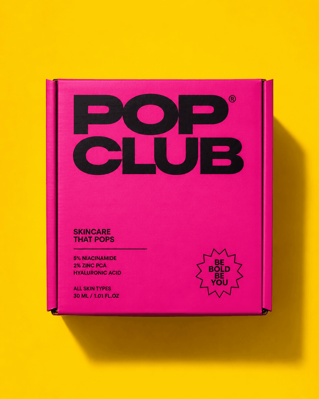
Bold skincare packaging
Skincare packaging made deliberately loud: hot pink, yellow, black type, and direct benefit-led communication.
Pop Club needed a packaging and campaign world that felt energetic, youthful, and easy to recognize within seconds on social platforms.
Challenge
Make a skincare brand feel playful without losing product credibility.
Solution
We paired unapologetic color with clear ingredient messaging and consistent packaging architecture.
Impact
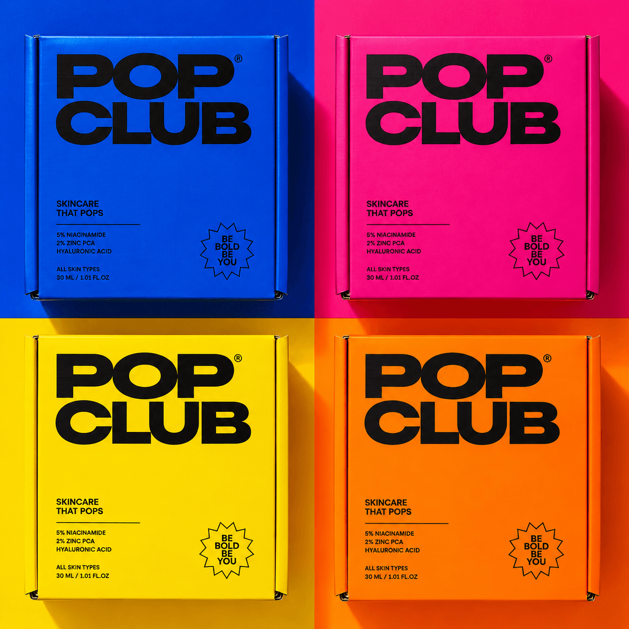
The result is a scalable system for boxes, bottles, launch posts, retail tiles, and campaign cutdowns.
Approach
The system uses thick typography, single-color surfaces, simple claims, and product-forward compositions to keep every image readable and bold.
Next project / 05
Aarambh→