
Challenge
Show variety and appetite appeal without making the visuals feel cluttered or generic.
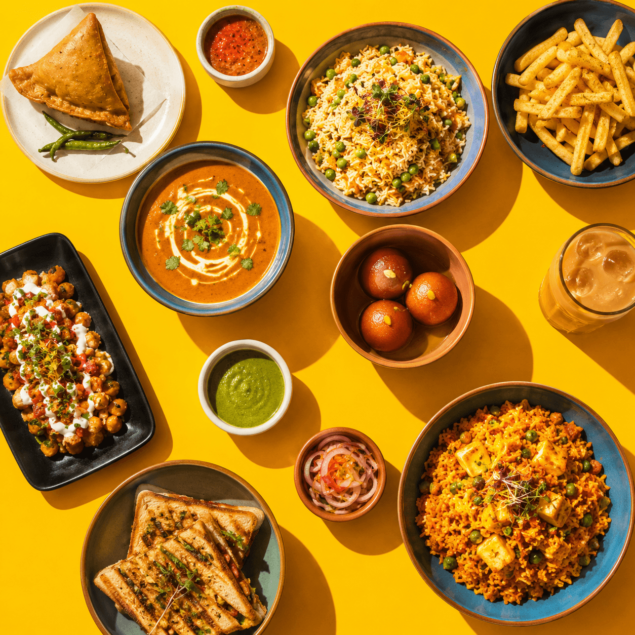
Indian food campaign
A food world that feels abundant, sunlit, and immediate enough to make the menu memorable at a glance.
Aarambh needed a campaign language that could make the menu feel energetic and premium across social posts, delivery tiles, menu cards, and launch communication.
Challenge
Show variety and appetite appeal without making the visuals feel cluttered or generic.
Solution
A high-saturation food system uses overhead compositions, strong color fields, and repeatable dish groupings to keep the campaign recognizable.
Impact
The launch assets create a repeatable visual recipe for menu highlights, social content, delivery banners, and seasonal campaign graphics.
Approach
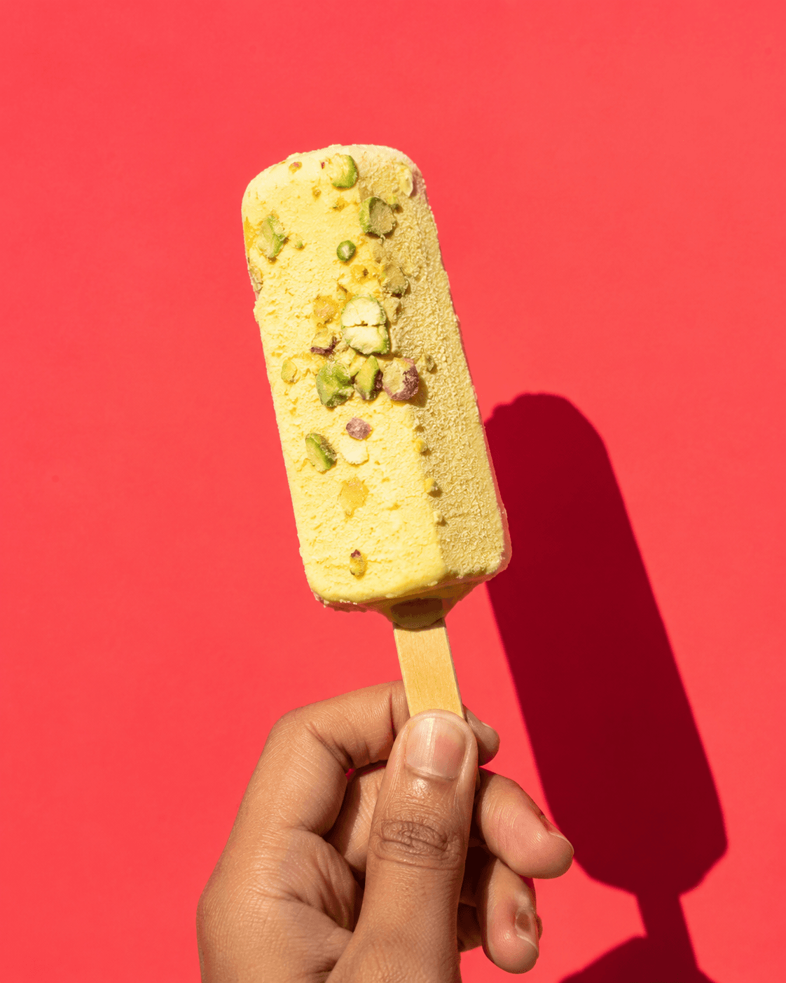
We leaned into overhead food spreads, bold yellow surfaces, crisp shadows, and close flavor details. The system balances abundance with clear framing so each asset works as a standalone post and as part of a wider campaign grid.
Next project / 06
Nexus→